 left, Barry Blitt (b. 1958)
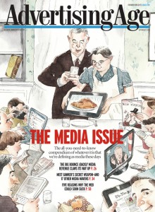
The Media Issue, 2010
Cover illustration for Advertising Age (September 27, 2010)
right, Norman Rockwell (1894-1978)
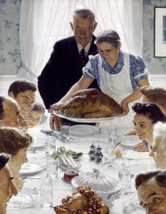
Freedom From Want, 1943
llustration for The Saturday Evening Post (March 6, 1943)
Norman Rockwell Museum Collection, NRACT. 1973. 022
Previously I wrote an essay about some of R. O. Blechman’s illustrations that repurposed other, older works of art to make new illustrations for contemporary audiences.* Image appropriation is an old and even respected activity, especially in the world of illustration art, where sometimes choosing to communicate by reusing a previous image is itself innovation. It takes a clever illustrator to modify an earlier image into something compelling for a new audience.**
As you can see above and below, illustrator Barry Blitt sometimes references the work of Norman Rockwell in his illustrations. For The Media Issue of the fall 2010 issue of Advertising Age his cover illustration appropriates Rockwell’s famous illustration Freedom From Want, 1943 and twists it to focus on the proliferation of media sources as opposed to Rockwell’s message of family togetherness and thankfulness in a period of war-time shortages and public conservation.
While parodies of this Rockwell image abound—from Steve Brodner for the National Journal, November 19, 2011; Patrick McDonnell, Mutts Sunday Panel, November 26, 2000; on The Simpsons; and on The Muppets—to name just a very few, it’s what is done with the parody that makes certain new versions memorable. Barry Blitt reuses all the characters from around the table in Rockwell’s painting. He even poses them similarly but each is engrossed in some sort of media—from electronic to paper–with the grandmother character holding an electronic tablet showing a digital image of a turkey on a platter along with virtual steam rising from the cooked bird instead of the real thing. The other obvious change is that there is more wall shown in the background on the left of the image, but instead of merely being decorated with wallpaper, Blitt’s version has the wall opened up to hold an inset bookshelf that is empty, except for one lone book. The implication is that in the older traditional home books abounded, while now in this modern age we get our information and entertainment from a myriad of sources such as those that can be seen commanding the attention of the guests at Blitt’s thanksgiving table. By recontextualising Rockwell’s famous illustration, Blitt makes a stronger point about the proliferation of media sources, which if using his version of the holiday table as the new norm, electronic access of media out-numbers the older style paper access. Choosing Rockwell’s Freedom From Want illustration as the starting point, Blitt’s panoply of everyman’s choices is grounded in one of America’s cultural icons.
Barry Blitt (b. 1958 Norman Rockwell (1894-1978))
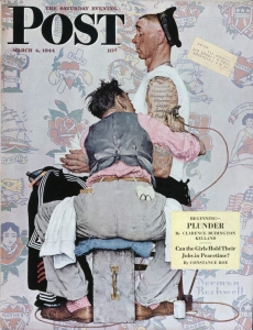
Skin Deep, 2012 The Tattoo Artist, 1944
Cover illustration for The New Yorker Cover illustration for The Saturday Evening Post (October 29 & November 5, 2012)
(March 4, 1944)
Recently Barry Blitt again appropriated a Norman Rockwell illustration to create a pointedly political cover illustration for The New Yorker magazine at the time of our national elections. Blitt was interviewed about this cover and his comments were posted on The New Yorker web site.** When asked how he came up with the concept, Blitt replied,
“My grandfather was a Sunday painter, he used to copy a lot of Norman Rockwell paintings, so I was aware of all the classic images at a very young age,” he told us. “Mitt Romney looks like he stepped out of one of those pictures. It’s not much of a stretch to imagine him in many of the wholesome, enduring American situations Rockwell painted. . . .”
“ ‘The Tattoo Artist’ features a sailor with a long list of girlfriends’ inked names crossed out on his arm,” he said. “This seemed like a nice tableau for highlighting Mitt the politician’s shifting positions and convictions.”
Instead of the crossed-out names of previous girlfriends as seen decorating the sailor’s upper arm, Blitt’s caricature of Romney lists the subjects he once supported and then turned against: pro-choice, tax cuts, immigration, stem cells, and 47 percent. Just peeking out from under Romney’s rolled up t-shirt sleeve are other tattoos. More faintly drawn in the background around the central figures are more possible tattoo choices available to the presidential candidate: including a sailing ship titled “Cayman or Bust!;” an upside down top hat filled with money; a over-large elephant titled “Severely Conservative;” an American Flag; and a partially revealed face of a man with “Daddy, Sir!” under it. It is interesting to compare the images from Rockwell’s artist’s sheet of choices in the background of his illustration to Blitt’s; as you can see Blitt repurposed five of them for his illustration. ****
One of my favorite parts of Rockwell and Blitt’s illustration is the exaggerated back-side view of the tattoo artist with his very messy hair. The model for this character was Rockwell’s friend, neighbor, and fellow illustrator, Mead Schaeffer (1898-1980). During the 1940s Schaeffer was creating a pictorial chronicle of military duty of the fourteen branches of the U. S.armed services that were used as cover illustrations for The Post. Posing as the tattoo artist must have been a significant change of pace for Schaeffer.***** Blitt replicated the image of the tattoo artist, even if he made the color range of the character just a bit paler and the figure smaller in proportion to the Romney caricature.
In this instance, Barry Blitt’s choice of Rockwell’s illustration to parody may be more obscure to the broad range of American public, but its use is really very clever. By the time this The New Yorker cover illustration was published Blitt had already familiarized the public with his caricature of the Republican candidate. So while this Rockwell Saturday Evening Post image may not be as familiar to as many Americans, the inherent humor of the repetitive fickleness of the candidate is the essential focus of Blitt’s re-use of that illustration.
* See Exploring Illustration essay “Re Using Art” web published on May 13, 2010, https://www.rockwell-center.org/exploring-illustration/appropriating-art/
** Between 1990 and 2007, there were at least 27 New Yorker cover illustrations that were grounded in a parody of an older image. A quick study of New Yorker covers viewed at Cover Browser (https://www.coverbrowser.com/) yields an interesting overview. Between 1944 and 1989, I counted only 7 New Yorker covers that use earlier art as the source for their cover image.
*** Post by Francoise Mouly, “Cover Story: Mitt Romney’s Tattos,” October 19, 2012. https://www.newyorker.com/online/blogs/culture/2012/10/cover-story-mitt-romney-norman-rockwell-tattoos.html
**** Among the materials Rockwell gathered while working on The Tattoo Artist was a copy of the tattoo sample sheet by tattoo artist A. Neville. See, st1976_6846 and st1976_6847 in projectNomran reference files available on the Rockwell Center web site and on the Norman Rockwell Museum web site go to https://www.nrm.org/collections-2/projectnorman/. According to an artical in The New York Times (July28, 2013), “The Canvases Walk in the Door” by Leah Finnegan in “Neighborhood Joints: in the Metropolitan Section of the paper, tattoo artists call their sample sheets “flash.”
***** Mead Schaeffer’s daughters also posed as models for other of Rockwell’s illustrations, including posing as the girlfriend for the Willie Gillis series of Post covers also done during the war.
January 10, 2013
By Joyce K. Schiller, Curator, Rockwell Center for American Visual Studies, Norman Rockwell Museum


