Often there is a permeable line between illustration and art. Illustration is created for use in a story, advertisement, or as a cover image and is therefore intended to be seen in reproduction; art is sometimes made without a specific purpose and while it might be reproduced, it is intended to be seen and experienced face to face (so to speak). The permeable barrier between illustration and art is a reality because neither art or illustration is created in a vacuum. All art reacts to and acts on the culture in which it was created. So why should I be surprised by a magazine cover illustration that is strangely reminiscent to a style of painting pursued by American artist Charles Sheeler in the early 1950s? Let me show you what I mean.
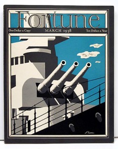
Stanley William Crane (1905-1973)
Battleship Guns
Cover illustration for Fortune (March 1938)
In the spring of 1938, Henry Luce’s Fortune magazine was published with a cover illustration of naval battleship in black, white, and gray against a teal blue background sky dotted with a few clouds. The image is very spare, the details of the ship are only minimally relayed. But the one detail that gives this illustration a sense of reality are the shadings and shadows cast by one part of the ship against another. This cover illustration was the work of Stanley W. Crane, an Indiana-born artist, trained initially by his father and then by three plus years of study in France.* Crane’s work as an illustrator appears to have been primarily focused on poster design. Without much information yet available about Crane or very many of his illustrations to see in comparison, it is impossible to understand if this Fortune cover illustration was unique or was a style of image making Crane was pursuing. In 1942, Stanley Crane won a first prize in the United States and Canadian Section of the Museum of Modern Art’s competition for posters illustrating the hemisphere united in war. Unfortunately I still have not located an image of this poster design.**
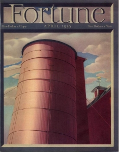
When Fortune magazine began publication in 1930, its publisher Henry Luce decided he wanted his new magazine to have beautiful covers. To that end the magazine hired leading artists and illustrators of the day to design the covers. In 1939 Charles Sheeler was commissioned to create a cover for that year’s April issue. While the image is focused on farming, the view is as though you were standing close to and looking up at a grain silo. The magazine calls the tower a grain bin, which is generally shorter and squatter than a silo and holds dry matter. A silo can also store bulk dry matter, but it is more commonly used to store silage (fermented feed), grain, and/or other sorts of food products.
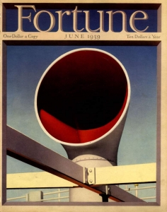
In June 1939, another Sheeler cover illustration for Fortune was of a steam ship funnel. And the following year Fortune published a portfolio of Sheeler’s work in their December 1940 issue.***
What I’m dancing around is that it is entirely likely that Sheeler was aware of other cover illustrations created for Fortune magazine. And while there is no visual relationship between Sheeler’s grain silo and his ship’s funnel and other Fortune covers by other artists, each image forges links forward in time as well as backward. Sheeler described the type of image we see above, as his natural inclination to focus on the intentionality of buildings and machinery and their inherent geometrical order.**** Others called this focus ‘Precisionism.’
In the early 1950s Sheeler’s style shifted again. “As he entered the 1950s, Sheeler developed a distinctive late style
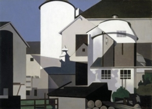
Charles Sheeler (1883-1965)
Conversation Piece, 1952
Oil on canvas
Reynolda House Museum of American Art, Museum Purchase, 1977.2.4
A native of Pennsylvania, Charles Sheeler was drawn throughout his life to the farm scenes typical of his home state. He was committed, however, to presenting them in a fresh vision, one that revealed in modern visual language the structural harmony just under the surface. In Conversation Piece, he reduced the architectural forms of the silos and barns to a series of planes, transforming the scene from a country farm to a kind of rural cityscape. Remarkable in this farm setting is the absence of almost any hint of nature. Instead, man-made structures dominate the picture plane, and intersecting horizontal, vertical, and diagonal lines lend the painting a sense of dynamism and power. I’ve often thought that this painting should have been ‘Remembrance of the Past’ based on the way the ghost forms of an older house, barn, and silo float over the bigger and more visually solid forms of the contemporary structures.
But if you go back to the beginning of this posting and look again at Stanley W. Crane’s cover illustration, doesn’t there seem to be a visual linkage between his stark and simple vision of a battleship and the stark but layered geometry of Charles Sheeler’s Conversation Piece? Also a photographer, Sheeler once remarked, “Photography is nature seen from the eyes outwards. Painting is nature seen from the eyes inwards.”****** What sort of inward journey did Charles Sheeler make to get from the poster-like simplification of Crane’s image to his own dance between architectural past and architectural future? Even without our being able to chart the path between the two works, the connection is still there.
* Paul F. Berdanier, “Opinions by 12 of the Country’s Leading Design Authorities” from The Stamp Specialist Orange Book, published in 1941. My thanks to Terence Hanley for his assistance with Crane’s biography. Mr. Hanley is an illustrator and cartoonist and he writes a blog on Indiana Illustrators and Hoosier Cartoonists at https://indianaillustrators.blogspot.com/
** Darlene J. Sandlier, Americans All: Good Neighbor Cultural Diplomacy in World War II (Austin, TX: University of Texas Press, 2012): 139-40. “MOMA published a pamphlet with illustrations of the prize-winning artworks . . . . The contest was written up in major magazines and newspapers, including Newsweek (November 2, 1942), the New York Times (October 21, 1942), and the Christian Science Monitor (November 7, 1942, with color images).”
*** See, “Power: A portfolio by Charles Sheeler”, Fortune (December 1940) Volume XXII, Number 6.
**** https://www.aaa.si.edu/collections/interviews/oral-history-interview-charles-sheeler-12824 Archives of American Art, transcript of Charles Sheeler oral history interview, June 18, 1959, conducted by Martin L. Friedman.
****** https://www.metmuseum.org/toah/hd/shee/hd_shee.htm by Jessica Murphy, Department of Modern and Contemporary Art, The Metropolitan Museum of Art.
****** https://quote.robertgenn.com/auth_search.php?authid=2712
August 22, 2013
By Joyce K. Schiller, Curator, Rockwell Center for American Visual Studies, Norman Rockwell Museum


