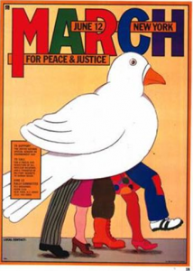
The multi-disciplinary and talented Seymour Chwast is not only famous for his illustrations, but contributions to the graphic design and art-direction spheres of the commercial world. In 1982, Chwast completed an illustration for the Peace March Committee, specifically an announcement promoting their anti-nuke rally on June 12 in New York.
The lack of visual depth is noticeable upon first glance. There is very little shading, and when it is employed, it is very stylized with a crisp edge as opposed to a gradient fade. This stylization is further enhanced by the dark outline of each shape, using it as a way to give definition and additional details to the illustration. The colors are flat yet bright, with Chwast breaking up solid color with pattering on a men’s pant and women’s skirt.
Conceptually, the large white bird makes perfect sense with the message of the announcement as the dove is the symbol of peace. The bird mostly covers the five legs, leaving them with no real identity, aside from the fact that they are human beings of different races with multiple clothing styles (and therefore jobs, lives, social circles, and more). The lack of visual depth blankets the dove over the legs, making their deeper identities not as important, or at the very least not the focus of the piece. The dove and what it stands for is pushed above all in the illustration – the top of our visual hierarchy. As the five legs move forward, representing the diversity of people marching, they do so together underneath the dove of peace.
[1] Seymour Chwast and Steven Heller, The Left-handed Designer (New York: Abrams, 1985): 29. This peace march and rally drew and estimated 750,000 to one million people to New York city to participate.
November 3, 2011
By Sara Barnes, graduate student MFA Illustration Practice, MICA (Maryland Institute College of Art)


