Shirley Smith (dates unknown)
Jacket design for Harper Lee’s To Kill A Mockingbird, first edition (New York: J. B. Lippincott & Co., 1960)
Harper Lee’s powerful drama, To Kill A Mockingbird was first published on July 11, 1960. The original dust jacket was designed by Shirley Smith.* By placing the story’s oak at the cover’s spin edge with leafy branches poised over the author’s name, each reader is invited to place themselves under the sheltering branches of this large and sturdy oak. Smith’s choice of colors was inspired. She used a rich red brown color for the cover’s background like red earth after a rain of the lower Alabama locale. As you can see on an original dust-jacket covered book, the bright green of the leaves is repeated in the first three words of the title. ‘Mockingbird’ is printed in white perhaps reflecting one of the book’s significant lines,
“Mockingbirds don’t do one thing except make music for us to enjoy. They don’t eat up people’s gardens, don’t nest in corn cribs, they don’t do one thing but sing their hearts out for us. That’s why it’s a sin to kill a mockingbird.”
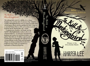
Anticipating the books 50th anniversary, a variety of publishers focused on producing memorable looking volumes. The edition produced by Grand Central Publishing appeared in April 2010 with a cover designed by the English illustrator and designer, Sarah Coleman, also known as Inkymole (see above). On her web site she describes what part of the story motivated her choices.
For me the most poignant moments are those when the feared Boo Radley leaves his little gifts for Scout and Jem hidden in the tree, especially the tiny figurines of the children. That needed to be central to the image and in the end, it literally does form ‘the spine’ of the book. The other elements were Scout’s tomboy clothing and the trees (forming play areas and hiding places), and, since I’ve been working with silhouettes a lot recently, a nod to the work of American artist Kara Walker, whose work frames themes relevant to the book such as race, history, narrative, power and shame.**
This design was approved by both the art director and the author. Like the original dust jacket, Inkymole used the oak tree to anchor her design. Notice how the tree limbs that extend over the back cover are still leafed out while those on the front are skeletal and blighted. Indeed the few leaves on the front cover are falling from their branches. The images of Jem (on the back) and Scout (on the front) are done like painted silhouettes.
In 2012, I wrote an essay about the use of painted silhouettes in illustration. *** Painted silhouettes were popular in England and America in the 18th and 19th centuries. After the form and contour of the figure was defined the artist detailed the figure’s hair and clothing around the form’s edges using very fine brushes or pen points and pigment or ink. Like a cut silhouette, whisps of hair or the revelation of gathers or folds of materials along with posture and the elucidation of facial features create the picture and provide the visual clues that inform us of the character and personality of the figure. It takes real skill to convey meaning and emotion without all the painterly details we are use to seeing.
Inkymole conveys the summertime indolence of Jem and the focused attention of Scout as she looks for and listens to the song of the mockingbird. Tomboyish Scout is seen here as sensitive enough to care about the Mockingbird and by extension about Boo Radley—both whose only function is to give beauty.
Illustrator Hugh D’Andrade was commissioned to create his cover by Sterling Press for a 2011 leather-bound edition (see above). D’Andrade revealed that he was asked by his publisher to evoke “the famous silhouette cover”.**** D’Andrade placed the oak’s trunk at the front right edge of the cover with the leafy branches extending across the spine and the top of the book’s back cover. Inkymole’s mockingbird is on the front cover, D’Andrade’s is on his design’s spine. D’Andrade also shows Scout looking into the tree’s hiding place. According to D’Andrade, Harper Lee provided “. . . suggestions on how to ensure that Scout looked as if she were actually tipping up on her toes to view the gifts hidden in the knot of that old tree.” ***** Although we cannot see the treasures hidden within, D’Andrade included the broken faced watch on the book’s spine while on the back cover the figures of Atticus Finch and his children (Jem and Scout) are silhouetted against the town in the far background.
Each of these three covers represents and roots the story in and at the oak, with its sturdy timelessness, but each focuses on a slightly different aspect. Shirley Smith’s cover shelters the story under the tree’s canopy. Sarah Coleman’ oak is both protective and challenged, but at its core it holds and protects the sharing and generous nature of the children for one another including Boo. While Hugh D’Andrade’s cover still employs the oak, it is the surrounding town that appears to anchor Harper Lee’s story and finally the solid honor of Atticus Finch who holds and anchors his family.
Isn’t it wonderful how much a silhouette can reveal.
My thanks to Sarah Coleman and Hugh D’Andrade for permission to use their book cover designs in this essay.
* If anyone knows more about this first edition cover, I hope you’ll contact me.
** See Inkymole’s blog, https://inkymole.blogspot.com/search?q=Mockingbird
*** See https://www.rockwell-center.org/exploring-illustration/silhouettes-on-a-shade/
**** I assume that he is referring to the cover previously created by Inkymole. See Hugh D’Andrade interview on That Cover Girl web site, https://thatcovergirl.com/2012/01/09/artist-abbreviated-hugh-dandrade/
***** See Hugh D’Andrade’s blog, https://hughillustration.com/2011/03/to-kill-a-mockingbird/index.html
July 11, 2013
By Joyce K. Schiller, Curator, Rockwell Center for American Visual Studies, Norman Rockwell Museum


