Howard Chandler Christy (1872-1952)
The Bookman, Feb. No., 1895
Advertising poster
Delaware Art Museum, gift of Helen Farr Sloan, 1993-132
The literary magazine The Bookman began publication in February 1895. Produced by the New York publishers Dodd, Mead and Company, The Bookman* was a compilation of articles, book and author news, book reviews, and book advertisements focused on the American publishing industry. While a large number of the ads were for Dodd, Mead publications, there were also ads and articles on the products from other publishing houses. The magazine was intended for book readers, book buyers, and members of the publishing industry. The Bookman even included bestseller lists that ranked the popularity of bestselling books. These lists were initially organized by city and region (including Montreal and Toronto, Canada) with New York City’s statistics divided between the leading booksellers located uptown versus downtown. The rankings motivated readers to consider that certain books might be better than others and therefore worthy of their attention.**
The initial publication of The Bookman was advertised with an unusual poster designed by Howard Chandler Christy. In 1895 Christy was a mere 23 years old and had studied art at the Art Students League and at the National Academy of Design. When his funds began to run thin, Christy began working as a commercial illustrator. The above poster for The Bookman is one of his early illustration commissions. Not only is its horizontal orientation unusual, its size, 7 3/4 tall by 24 1/2 inches wide, is atypical for an advertising poster. He produced another horizontal composition to promote the September 1896 issue.
Christy cleverly used the poster’s horizontality to create his visual story of preoccupied people moving along city streets. The left and right scenes are constructed in a slightly smaller scale to imply that they are further back in the space of the image. Christy also positioned the characters in the three scenes so that they move into the scene at the left, across the scene in the middle section, and then move out of the scene with their backs to the picture plane at the far right. The left group is seen in the vicinity of a newspaper and magazine stand on the street. A pretty young girl holds her purchase in her hands and looks out at the viewer. By locating her just left of the initial T and having her engage the viewer, an observer is easily drawn into the image. The middle section shows a group of three pedestrians each holding papers in their hands with the beautiful lady in the foreground magazine’s cover showing The Bookman on the cover. The final group of pedestrians at the far right shows them moving away and out of the scene. Notice the woman at the far right—she is the back view of the same girl who looked out at us on the left. The scene also reflects child labor typical of the time with a young boy huddled in the cold at the far right of the scene. The box at his side indicates that he works as a boot black.
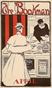
James Montgomery Flagg (1877-1960)
The Bookman, April, 1896
Advertising poster
In the following year the April 1896 advertising poster for The Bookman was the work of another very young illustrator, the 18 year old James Montgomery Flagg and was done while he was still a student at the Art Students League in New York.*** Flagg’s poster is traditional in size and orientation. The image shows a woman (not exactly dressed in the height of fashion, but presentable) with her back to the picture plane as she purchases a copy of The Bookman at a newsstand. Behind the sales table an older man in a worker’s cap lifts a copy of the magazine off the pile to hand to her. The cover of the magazine is the same as the larger poster attached to the front of the stand’s table—and the poster’s masthead is easier to read.
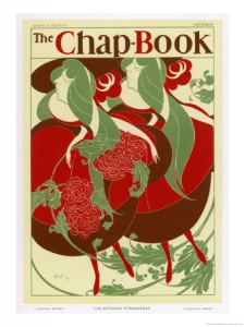
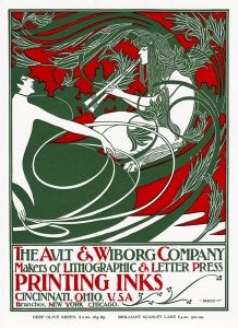
I believe that the poster on the front of the newsstand just left of The Bookman poster is a bit of a visual and verbal joke. The image on that poster is reminiscent of poster designs by Will H. Bradley, as you can see below in Bradley’s 1894 poster for the magazine The Chap-Book and his 1895 poster advertising printing inks.**** Both posters utilize swirling lines and forms to animate the images. Flagg’s tongue-in-cheek version of those posters includes words top and bottom that combined say, ‘Read nothing’.
Will H. Bradley (1868-1962) Will H. Bradley (1868-1962)
The Chap-Book, 1894 Ault & Wiborg Printing Inks, c. 1895
Advertising Poster Advertising poster for the Ault & Wiborg Company
The Bookman was not the only magazine focused on books. During this period others with the same focus included Book News, The Book Buyer, and The Printer and Bookmaker. There are examples of advertising posters for each of these publications. One of my favorites is by Walter Appleton Clark. A classmate of James Montgomery Flagg, Clark was a gifted, prolific but short-lived illustrator. Like Flagg, Clark began to receive illustration commissions while still a student at the League. I find it fascinating that these young publications appear to have sought out young illustrators to help focus interest in their market.
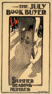
As you can see in the poster below for The Book Buyer, Clark was a master of light and shadow. While we cannot see the locale setting for this image, Clark indicated that there are other people in close proximity to the centrally seated reading woman through the rendition of their shadows on the ground around her. The reader is almost lost in the deep shadow cast by the hooded wicker Porter’s chair***** that surrounds her. In this instance, the chair’s enclosure helps to reinforce the poster’s meaning that a focused reader is often enclosed in the world created in the pages of a good book. That experience of being drawn into the world inside a book is just what these periodicals were selling.
Happy reading!
Walter Appleton Clark (1876-1906)
The July Book Buyer: Summer Reading
Advertising poster
Delaware Art Museum, gift of Helen Farr Sloan, 77-285
* The magazine’s title was lifted from a phrase written by James Russell Lowell, “I am a Bookman.”
** The contemporary versions of these bestseller lists may be found in the Book Section of The New York Times and in The New York Review of Books.
*** By the age of 14, Flagg was already contributing work to Life magazine and at the age of 15 he was a staff artist for Judge magazine.
**** See another reference to Bradley’s Chap-Book poster illustration in the Exploring Illustration essay from September 3, 2009 about Charlotte Harding’s illustration, “The Daughters of Desperation.” Another reference to Bradley’s Ault & Wiborg poster can be found in the Exploring Illustration essay from February 9, 2012 called “Reveling in Color.”
***** Porter’s or Sentry chairs were used by hall porters in great homes or palaces. The enclosed seat protected the servant from drafts as they kept watch of the front door. It was also used by invalids and the elderly to protect and, as in this poster, to shade them.
February 20, 2014
By Joyce K. Schiller, Curator, Rockwell Center for American Visual Studies, Norman Rockwell Museum


