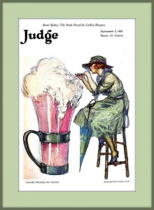
 John LaGatta (1894-1976)
Susie Sipley- The Soda Fiend, 1921
Cover illustration for Judge (September 5, 1921) but also a story illustration for
“Susie Sipley-The Soda Fiend” by Gelett Burgess
You might remember the Exploring Illustration essay, “S.O.S. Means Save on Sugar” – The Campaign Against Sugar in the United States written by Daniel S. Palmer and web-published in October 2010, in which he explains the motivation for two WWI posters. The one by Ernest Fuhr (see below) probably from 1918 and focuses on foregoing sweet soda fountain sodas to help support America’s war effort, This war poster provides an interesting comparison to John LaGatta’s post-war 1921 Judge magazine cover illustration (seen above). So much happened in the short three year period between Fuhr’s poster and LaGatta’s illustration.
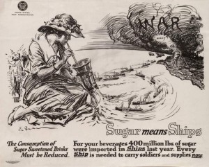 Ernest Fuhr (1874-1933)
Sugar Means Ships, c. 1918
Poster for the United States Food Administration
Photo: University of Minnesota Libraries
President Woodrow Wilson attempted to keep the U. S. out of Europe’s war that began in August 1914. Wilson felt that America’s interests lay in continued trade with all the war’s participants. His 1916 re-election campaign used the slogan, “He Kept Us Out Of The War.” But the Germans did not want the Americans trading with Great Britain so by January of 1917 they began to sink American ships carrying goods to England. When President Wilson asked Congress for a declaration of war against Germany in April of 1917, he understood that he would have an uphill battle to convince America that participation in the European war was now imperative. To that end an executive order created a Committee on Public Information (CPI) to create the propaganda, especially in the form of posters to convince the American public to get behind the country’s war effort.
Sugar and a variety of other food stuffs were restricted at home to aid the war effort abroad. Soda fountain drinks—phosphate sodas, egg creams, and ice cream sodas—were made with various combinations of phosphate soda or bicarbonate soda, a fruit or a flavored syrup, milk, and sometimes ice cream. The phosphate or bicarbonate gave the drink a bit of a tangy or sour taste. The fruit or syrup flavoring were made with generous portions of sugar to counterbalance the tang.*
The soda, whatever its form, provides carbonation. The carbonation mixed with the other ingredients gives the drink its bubbly head. The young lady in Fuhr’s war poster has already drunk her phosphate down and through her glass she is sucking up the supplies that the armed forces fleet should be using to win the war. By the time John LaGatta illustrated the cover of Judge, the war was over, the troops were home, and abundant sugar was again available for creating gigantic phosphate sodas.
Soda fountains were a ubiquitous aspect of city and town life in America. “By 1875, there was a soda fountain in almost every city across America. It was now becoming part of the American culture. In the peak of summer, sales were reaching 1200 glasses of soda per day.”** After the war, soda fountain offerings were as popular as ever.
As you can see in both these illustrations, they are from just before the flapper era of very short skimpy dresses. By the teens women’s hemlines were already shorter. Shoes worn with above the ankle-length skirts in style in 1918 appear trim and elegant. Unlike floor-length dresses of the turn-of-the-century, by teens and into the 20s feet and ankles were very visible so women’s shoes were more likely to be attractive.
While the women’s fashions seen in the two illustrations appear to be rather similar, it is the young ladies’ poses that indicate a shift in social mores. In Fuhr’s war-time poster, the young lady sits demurely on the ground with her legs tucked to the side hidden by her demurely draped skirt. LaGatta’s young lady appears to be rather more brash with her legs splayed open, her umbrella resting against her right thigh and her feet twined around the legs of her stool. Her more risqué- appearing dress seems to be made of two layers of a sheer green material. The shoulder area of her dress is considerably more revealing as it is made of only one thin and see-through layer.
In the post-WWI era, many young women and men turned away from the earlier more rigid structure of society and instead sought to break from typical conventions choosing to grab new experiences and make different choices than their parents or older siblings had done. Soon the activity and life-style of these young people in the 1920s will earn the appellation, The Roaring Twenties. In 1921, John LaGatta’s cover illustration provides rather broad hints to this new attitude. The woman, Susie Sipley, indulges in a gigantic pink soda, so she is called a Soda Fiend. Her pose and clothes are equally indulgent, especially when compared to Fuhr’s earlier poster.
My thanks to Kristy Hawke, for her assistance trying to locate a copy of Gelett Burgess’s story.
* See, https://www.artofdrink.com/soda-fountain/drinks/homemade-soda/ and https://www.artofdrink.com/soda-fountain/drinks/chocolate-phosphate One of the most interesting fact revealed in the recipe is that simple fountain syrup is made by combining 3 cups of sugar with 2 cups of water.
** See, https://www.artofdrink.com/soda-fountain/history/ Darcy O’Neil has a wealth of information about soda fountains and the drinks they made on his web site.
August 8, 2013
By Joyce K. Schiller, Curator, Rockwell Center for American Visual Studies, Norman Rockwell Museum


