Woman’s Day magazine emerged in 1936 as a publication with a commercial focus based on values such as homemaking, food, nutrition, physical fitness, physical attractiveness, and fashion. Similarly to McCalls, it shares traits with the other “Seven Sisters” magazines: Better Homes and Gardens, Good Housekeeping, Family Circle, Ladies’ Home Journal, and Redbook. It is a magazine that revolves around idealized female roles within the domestic sphere and relies heavily on the power of persuasive visual elements. Because the majority of the content at that time was either advertising or pieces designed at self-improvement through the consumption of products, the magazine constantly shows images of women in varying stages of success via some product or another. At no time was this more true than the 1950s.
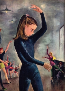
Economically speaking, this period in America saw the expansion of a middle class, along with the post-war baby boom, and the credit card was introduced. Thus, there were many things to buy and sell. Within that world of consumption and acquisition, Woman’s Day, like the other “Seven Sisters” magazines, published many beautiful illustrations including the work of John McClelland. John McClelland’s illustration we are focused on, of a young woman mid-pose in ballet class, is as much about a young woman’s role in society as it is a story illustration.
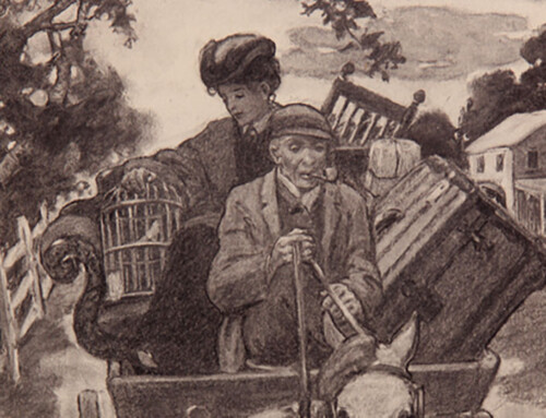
The foreground subject is a young girl dressed in a deep blue leotard with her hair loosely tied back. Her arms strike a pose and her head is angled down in concentration. Her eyes are closed, making her appear focused on poise and grace. Beyond her figure we see a line of other girls making similar attempts at elegance, some successfully, some less so. This is a picture focused on a lesson in body position and female deportment of the 1950s. Examining the cast of girls behind the main figure, we see varying degrees of grace, but also various ages and sizes. The figures are more stylized than realistically portrayed, their features are lost in their generalized depiction rather than being revealed as richly detailed drawings. If we contrast McClelland’s girl to that of a Gibson Girl, the late nineteenth/early twentieth American standard for beauty (see below), the difference between the styles is vast. The elaborate hair styling and fine lines of the Gibson’s type of girl are absent, as is a depiction of their elaborate dress. But you can see evidence of that older style in the far right corner of the picture. Look closely at the pianist playing as the teacher instructs. The pianist’s hair is in a Gibson Girl-like updo and her dress looks similarly old fashioned. The piano itself, is reminiscent of a past time. It is as if this figure embodies hints at past womanhood, while the bright, young prominent dancer heralds a new style. The teacher figure reiterates this new image of femininity. She appears to be holding her pose effortlessly, her chin is high and she alone has long thick blond hair, also tied back neatly. Her elegance depicts a beauty that is quite different than the pianist and, by extension, of the past.
Charles Dana Gibson (1867-1944); The Art Lesson, 1901; print.
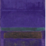
McClelland produced an interesting work stylistically. Here he seems to be experimenting with a rather loose, textured background. As previously mentioned, the figures themselves are not tightly rendered, rather, they are a bit awkwardly painted. In this way McClelland expresses the awkwardness of pre-adolescence and the notion of learning through movement. This can relate to the actual ballet class happening in the piece, but also to the physical paint strokes of the artist. In fact, he may well have been influenced by the new style of art world taking hold–Abstract Expressionism and the work of contemporary painters like Jackson Pollock and Mark Rothko. Though McClelland’s work is clearly illustrative, the hazy brushstrokes in the background are reminiscent of paintings such as Rothko’s Blue Green Brown.
Mark Rothko (1903-1970); Untitled
It is interesting to consider McClelland’s illustration style in contrast to early 20th century famous illustrators like Howard Pyle and N. C. Wyeth whose work, though painterly, contains far more detail and finish. The background of McClelland’s story illustration is vague, particularly where the floor meets the back wall. At this point the image contains no realistic detail whatsoever. This is a departure from the realism of Pyle and Wyeth. Just as the young ballet students in McClelland’s image are forging their way into a new style of femininity, McClelland too experimented learning a new more modern style of illustration.
November 1, 2012
Sarah Jacoby, Grad Student MICA MFA Illustration Practice, Critical Seminar course, Fall, 2012


