By Abigail Malate, grad student MICA’s MFA Illustration Practice; Fall 2013, Critical Seminar Final Paper
Within the genre of science fiction, there always exists a special interest in a vehicle– specifically a starship–that is central to the story. From the USS Enterprise to the Millennium Falcon might we list myriad famous starships. Less common, it seems, is the presence of a space colony or habitat as central to a science fiction narrative. What examples we have are almost always derived from three concepts designed by NASA in the 1970’s: the Stanford Torus (or toroidal colonies), Bernal spheres, and cylindrical colonies. Perhaps the most famous of the three is the torus, iconic to narratives as classic as 2001: A Space Odyssey and as recent as Elysium. However ubiquitous the Stanford Torus has become, little is known regarding the origin of the concept. Whether or not the concept was unique to the moment in 1975 when it was developed is seldom talked about, nor is the logic behind these structures common knowledge. The process of the artworks made to visually deliver these concepts is even lesser known, simply being attributed to the artist and little more. Through an analysis of the works of Don Davis on the Stanford Torus, Stanley Kubrick’s concept of Space Station V, and Neill Blomkamp’s Elysium space habitat, one might better understand the context of the space habitat in science fiction and beyond.
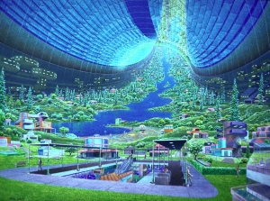
In the 1970s, NASA conducted a series of space colony studies at NASA Ames. From these studies, NASA produced the groundbreaking concept of the Stanford Torus. As with all innovations, the inception of this concept comes with its own quirky story. The summer of 1975 started with Larry “Wink” Winkler and Gerard O’Neill butting heads. These two men, along with a team of scientists and designers, had been appointed by NASA Ames to “design a system for the colonization of space”1. Naturally, the first question they needed to answer was how to produce gravity for this human habitation. Wink, particularly interested in the effects of space living on human physiology, insisted that the team conceptualize a habitat that would only spin at one rotation per minute (one rpm) to produce Earth-like gravity (one g). O’Neill, the technical director of the team, was unenthused, having previously designed a detailed concept that would spin at 3 rpm–a rotation that is faster and would likely result in space-sickness2. To break the impass, the Summer Study participants crammed together to design a colony that would give one g at one rpm. Through the night, they labored to produce what we now know as the Stanford Torus. The design for this structure essentially entails a large tube that rotates, creating artificial gravity along the inside of the tube by way of centrifugal force3. In this way, colonists inhabit the inner side of the tube, with the outer side exposed directly to space. Don Davis, the artist of much of the toroidal colony paintings, was then hired to produce his illustration of the interior of a Stanford Torus (fig. 1), which is perhaps one of the most famous works from the NASA Summer Study. Davis, up until this point, had been a traditional artist specializing in oil and acrylic paints4. He then came under the tutelage of Chesley Bonestell, one of the most renowned space artists, by which Davis truly solidified his calling5. The illustration Davis produced is breathtaking, depicting an idyllic lived-in landscape, with colonists happily going about their days in a clean, suburban foreground, while sloping hills lush with greenery cascade into the background. He uses myriad tones of green and blue to express the calmness of a natural environment, punctuated with pink tones to provide harmony. Through this work, Davis gave the public a romantic ideal with regards to future space colonies. Science writer Veronique Greenwood reflects on the process the Summer Study scientists took, saying, “
“[Space artists] base…things on the reality, [so that they] can show a hint on what is known about the subject matter in a given work of space art, as well as what it is that inspires us and what it is that intrigues us about one of these places that we can share visually through our work.”8
In this way, Davis, together with O’Neill and his team of scientists, worked to inspired people to a positive concept of colonizing space that was at once realistic and idealistic, thereby positing a bright, new world by which to live and thrive.
Going back a few years in time, in 1968, Stanley Kubrick debuted his landmark film 2001: A Space Odyssey. Iconic to this film is Space Station V, a toroidal structure that orbits the Earth. Interestingly, Kubrick’s space station predates the NASA Ames 1975 Summer Study, and one may wonder if the NASA researchers were inspired by Kubrick’s concept. However, to be entirely accurate, the general concept of a ring-shaped rotating space station goes back to various sources: first, from 1929 when Herman Potočnik Noordung published The Problem of Space Travel 9, and then in 1952, when Wernher von Braun proposed the idea in a series of articles published in Collier’s Weekly10. Kubrick’s reasoning for choosing such a popular idea was simple: “Kubrick wanted absolute realism: he wanted the hardware on screen to look as though it really worked”11. Intent on depicting a realistic future, Kubrick then hired Harry Lange and Frederick Ordway, two men from a space consultancy company who happened to be in New York when he began working on the film. The resulting concept for Space Station V bears numerous external similarities to Davis’s torus, sporting rotating wheels with four spokes that lead to a transit center. Piers Bizony elaborates on the process of deciding on this shape, writing:
“The rotating space station owed its shape to the most serious proposals made by [Harry] Lange’s illustrious colleague and friend at NASA, Wernher von Braun. Lange and Kubrick agree on the famous two-wheel shape so that the rear part of the station could be seen as if still under construction by space workers, with ribs and girders exposed.”12
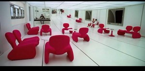
The realism that Kubrick sought is brought home by working with Wernher von Braun himself. Beyond its toroidal appearance however, Space Station V is quite the opposite to Davis’s torus. Space Station V is very austere in its interior, with white halls punctuated merely with black outlines defining doors and shapes, while red chairs populate a sterile meeting area (fig. 3). Perhaps it was this aesthetic Davis was reacting against when he sought an alternative to the “shopping mall” of strict white walls and arbitrary red chairs. Space Station V is, of course, understandably sparse, as it is in a state prior to full completion, and functions only as a layover stop for traveling space-goers. In this way, the two concepts of Kubrick and Davis are at once opposite and complementary, offering visions of the beginnings of space habitats as well as the more developed dwellings of the future. From Kubrick’s Space Station V, to Davis’s Stanford Torus, science fiction enthusiasts of the 1970’s were given two ends of the spectrum by which to ignite the imagination towards space life.
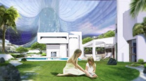
As we go forward into our own, nonfictional future, one must wonder whatever happened to the dreams of the past–of conquering the great unknown and settling in space. Neill Blomkamp’s recent film Elysium offers a peek into our current psyche, depicting a world segregated harshly between those of avarice and those in need. With Elysium, here too one is offered an example of a toroidal space habitat in the idyllic Elysium, however this time it is reserved only for the rich. One of the key concept artists, Ben Mauro, worked on an image remarkably similar to Don Davis’s older work (fig. 4). Here, we see two residents of Elysium in the foreground, enjoying a sunny day. The background shows us a clean, modular house, and a cascade of green recedes behind the house until out of view. However, the reality of the Elysium habitat is much harsher than Don Davis’ torus–where one was an ideal lifestyle for all, Elysium is a haven only for the rich13. In its contrast conceptually to the idealism of Don Davis’s torus, and the austere realism of Kubrick’s Space Station V, Elysium speaks to a grittier future. However, as with any form of art and illustration, such a standpoint is indicative of our time, where we have now become more aware of social strata and widespread violence since the 1970’s. However, with the resurfacing of the concept of the Stanford Torus in such a mainstream film, perhaps there is some hope after all. Such a large scale film has the potential of reaching the imaginations of a newer generation of space enthusiasts. Perhaps the lesson to be drawn by Elysium is one of caution against economic separatism, and coming from such a gritty narrative may inspire a push for the betterment of our current state of living.
Through images of the Stanford Torus–from Kubrick’s Space Station V, to Davis’s illustration in 1975, and Mauro’s recent concept art for Elysium–one is offered three varied visions of the future. Davis’s image is one of a truly paradisal future, Kubrick’s a vision of a future in the works, and Mauro’s one of a gritty dystopia. From all three might one draw their own conclusions regarding the potential path of humanity, as dependent on its moral decisions as a whole people. Indeed, science fiction has always acted as a vehicle to deliver the endnote that a better life will only become reality by the result of our actions. Perhaps this is the titular point in requiring a level of realism to science fiction–if one cannot project a space station as a potentially real and logical outcome of humanity’s actions, how then can we logically arrive at a prediction of our own future, be it a future worth living in or a future better left to fiction?
NOTES
1. T. A. Heppenheimer, “Our Life in Space.” in Colonies in space (Harrisburg, Pa.: Stackpole Books, 1977): 31.
2. Ibid., 114.
3. Ibid., 118.
4. Don Davis, “Why Create Space Art? – Panel Discussion” The Planetary Society video, 6:45. August 4, 2012. https://www.youtube.com/watch?v=pZ7T7zWBOoA
5. Ibid., 6:54.
6. “Photos: How NASA imagined life in a space colony would look 40 years ago.” 89.3 KPCC Southern California Public Radio. https://www.scpr.org/programs/take-two/ 2013/04/16/31362/how-nasa-imagined-life-in-a-space-colony-would-loo/?slide=3 (accessed December 9, 2013).
7. Don Davis, “Public Domain paintings by Don Davis” Don Davis: Space Artist and Animator. https://www.donaldedavis.com/PARTS/allyours.html (accessed December 9, 2013).
8. Don Davis, “Why Create Space Art? – Panel Discussion.” The Planetary Society video, 7:25. August 4, 2012. https://www.youtube.com/watch?v=pZ7T7zWBOoA
9. Noordung, Hermann, Ernst Stuhlinger, J. D. Hunley, and Jennifer Garland. The problem of space travel the rocket motor (Washington, D.C.: National Aeronautics and Space Administration, NASA History Office, 1995)
10. Werner von Braun, Man Will Conquer Space Soon (New York: Collier’s Weekly, 1952)
11. Piers Bizony and Stephanie Schwam, “Shipbuilding” in The Making of 2001: A Space Odyssey (New York: Modern Library, 2000): 43.
12. Ibid., 12.
13. Elysium, Film. Directed by Neill Blomkamp. Sony Pictures Home Entertainment, 2013.
Fig. 1. Don Davis, Stanford Torus Interior View. 1975. Oil on board. NASA Ames. From: Public Domain Works Done for NASA, https://www.donaldedavis.com/PARTS/allyours.html (accessed December 9, 2013).
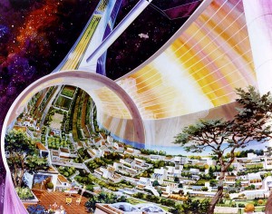
Fig. 2. Rick Guidice, Stanford Torus Cutaway View. 1975. Oil on board. NASA Ames. From: Space Colony Art from the 1970s, https://www.nss.org/settlement/nasa/70sArt/art.html (accessed December 9, 2013).
Fig. 3. Stanley Kubrick, 2001: A Space Odyssey. 1968. Screenshot from: 27:32.
Fig. 4. Ben Mauro, Elysium Concept Art. 2010. Digital. Available from: Ben Mauro, https://www.artofben.com/ELYSIUM (accessed December 9, 2013).


