Frederick G. Cooper was a writer, cartoonist, designer, and illustrator whose penchant for using lower case letters made him known as “F. G. Cooper, the lower case artist.”* An early 20th-century book on posters describes Cooper’s importance thus, “F. G. Cooper had contributed consistently to the development of the poster in this country and has always been conspicuous for excellent poster lettering, vigorous and legible. He is responsible for the present popularity of ‘lower case’ or small Roman letters instead of capital letters, and after Penfield, was the first to point out the advantages of this kind of lettering on the score of better legibility.”**
Born in Oregon and studied art at the Mark Hopkins Art Institute in San Francisco (although not for long), Cooper arrived in New York City in 1904. There he pursued his career as a freelance designer and illustrator, almost immediately contributing illustrations and cartoons to Life magazine.
By 1905 Cooper was producing work for the New York Edison Company including their corporate icon–a Colonial man with an oversized head. Years later Cooper described the impetus for the first Colonial man figure. During his initial interview with the advertizing manager of the Edison Company, their meeting was interrupted by a telephone call. Cooper listened to Arthur Williams say to the person on the phone, “We are always at your service.” From that expression of corporate service, Cooper envisioned the Edison Man, “. . . a cheerful, public servant, heralding the blessings of electricity . . . .” *** Repetitive use of that trade-mark character turned Cooper’s construct into an easily recognizable corporate icon.
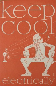
In 1919 Cooper created a publicity poster for Edison extolling the benefits of cooling-off in the summer’s heat by using electric fans. Printed in one color, a milky tomato soup red on creamy white paper, the image and text of the poster are rendered in the white of the paper. Instead of using his large-headed Edison man, Cooper instead crafted a perfectly proportioned smiling Colonial man wearing the same style of frock coat, vest, and buckled shoes as his iconic Edison man, even to the long whip-thin wig tail curling up from his back—almost as though this realistic image was the source for the large-headed caricatured figure. This Edison Man sits with his legs splayed and hands tucked against his hips facing, smiling and looking straight at, the blast of breeze created by the blades of the fan. “keep cool electrically” commands the poster’s text. One of my favorite aspects of this poster is that while the fan and the man appear to sit on something, that something is left to our imagination. Notice how the tails of Colonial man’s frock coat fold over the edge of his seat behind his knees.
Despite the intrinsic visual heat of the poster’s red color, the very spare-ness of this composition and the chilly whiteness of the graphics and picture produces the impression that the image is as cool as the idea being conveyed. A similar frugality is conveyed in the use of the alliterative language of the ad campaign, “keep cool.” It also helped that whoever chose the campaign language, the same spare coolness is suggested is the repetitive use of double vowels and a final consonant that either extends below or above the print line.
* Leslie Cabarga, The Lettering and Graphic Design of F. G. Cooper (Glenbrook, CT: Art Direction Book Company, 1996): 33.
** Charles Matlack Price, Poster Design: a critical study of the development of the poster in continental Europe, England and America (1913) found online at https://www.archive.org/stream/posterdesignacr00pricgoog/posterdesignacr00pricgoog_djvu.txt
***Cabarga: 23.
July 28, 2011
By Joyce K. Schiller, Curator, Rockwell Center for American Visual Studies, Norman Rockwell Museum


